Tuesday, March 24, 2015

20 MAR 2015


[visit #10]

Is this already over?

We have been learning so much and having a terrific time. Neither the students nor myself want this experience to end! This blog post, however, marks the last visit that I had with the incredible students of Mrs. Stone's third grade class.

I decided to try explaining contrast again using the strategy that Vicki had talked with me about last week. I had the students sit down at the front of the class and then I picked out concrete objects in the class and had the students tell me if there was contrast between the objects. We did that with color, size, direction, and a few other components of contrast. By the end, the students really were able to explain and determine contrast more effectively!

Their success in learning as their surroundings (their 'world') are integrated makes me believe in the importance of bringing the real world to students. I think that if teaching does not connect outside of the school setting does a disservice to kids. I want them to become participants in their community, not just passive consumers. This experience reinforced my desire to connect real world situations to the classroom, similar to one of BYU's unofficial mottoes which says "The World is Our Campus."

The rest of the class period today was spent working on the presentations and getting them ready to present. Some of the students were quicker than others and finished early while some were unable to finish their work by the end of class.

Even though I had come up with a few ideas of what those faster-working students could do once they were done, I still had to think on my toes of additional things that would be a meaningful use of their time. I had planned on giving them a one-word prompt for them to explore however they wanted, letting them have free time with the Chromebook, or learn to take photographs with their Chromebooks.

self portrait
This student even included a photograph in her presentation.
One student came back multiple times saying she was done with what I had given her! She was even able to do a test presentation at her desk to see how it would feel to give the presentation. Eventually, her question began to change from "What should I do?" to "Can I do ____?" showing she was building autonomy as a learner. That was fantastic to see (especially because I was running out of ideas for her!). What kinds of systems do you have in place for when students are done early or do not get done at all?

The following is an assortment of the slides that the students have created up to the point. Integrating reading, writing, technology, and art has certainly been a challenge and might have seemed overwhelming at times; but, the final products are looking good and have content that is appropriate for the third-grade level.


Additional characters were added to this slide and problems with contrast were fixed.
Small details were tweaked as the students gained
more technology and artistic skills.
A lot of the students ended up using arrows to direct a viewer's attention
from one part of the slide to another.
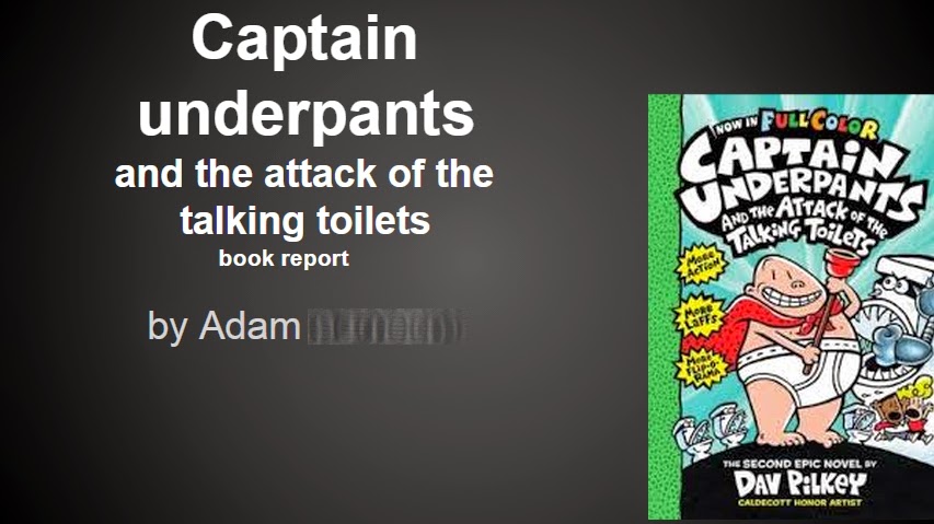
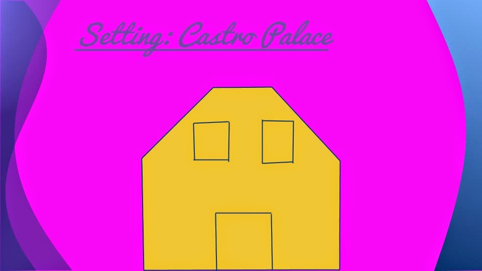
Adam combined appropriated images with his own drawings.
Marissa liked drawing digitally. Look at that cute dog!
Although not all of the presentations are done at this moment, Mrs. Stone will continue to work with them as they prepare for giving their presentations. All of them were excited to comment on each others' slides so I am hoping this excitement carries through to standing up and presenting to the class!

Some of my main takeaways (as found in my presentation linked below) are the following:
> Teach the children, not the lesson.
> Students trust you so much. Live up to it.
> Let their strengths & personalities show.
> Preparation & reflection go hand in hand.
> Teaching is little more than telling if you don’t
review in their own words.

I feel more prepared to work with students and other teachers to create meaningful learning environments and experiences after having participated in the Arts Bridge program. In the fall of 2015, I am heading to Houston, TX to do my student teaching in Visual Arts and in Spanish! Working with these kids has taught me to expect the unexpected and to roll with the punches that are thrown my way.

Students hard at work on their digital devices.


\\\Update\\\

Today was the final celebration of the Arts Bridge experience. Connie and I had the distinction of presenting all of our hard work and the learning that occurred when the visual arts were integrated into other subjects. Our presentation can be viewed here (or by clicking on the image below) and includes additional student work not featured on this blog.


It has been an awesome experience for both Connie and myself as we worked to infuse and naturally integrate the visual arts, We learned to work as a team and use our strengths to complement one another to ultimately create a more fulfilling, worthwhile experience for the students.


I hope you have enjoyed reading this blog and been inspired to look for connections between subject matter to engage students and promote deeper learning!

James Voss
Arts Scholar 2014-2015

Tuesday, March 17, 2015

13 MAR 2015


[visit #9]

I increased the amount of comments that I made on the students' work in preparation for this class period. It was interesting working out what kind of feedback to give to the students. With their concrete thinking, I knew they would most likely take any feedback I gave at face value. As I wrote, I found it difficult to walk the balance between saying enough and not saying too much. What kinds of things have helped you to give feedback that promotes and does not hinder learning?


I loved how making comments on each individual's presentation allowed for greater personalization and differentiation in teaching. Not all students are at the same level and I found that if I treated them like they were all at the same point, I would lose large portions of the class. I think that differentiation is an idea that is worth exploring further in terms of my teaching practice, especially in how it is related to integration of subjects. What opportunities or experiences have you had with differentiation in your own classrooms? How has technology or art allowed you to differentiate more effectively?

In addition to the comments, I decided that during this visit I would show the students a few examples of student work that I thought was particularly good and talk about one common element of art that was not present in much of the student work--contrast.

I loved the artistic merit Michael's slide demonstrates.
We also used it to understand contrast better.

Lucy chose her color scheme based on colors
associated with the book/movie.

As I spoke with Vicki Gehring, my mentor teacher, about the outcomes of the lesson, one thing that stood out to me was the level of understanding that I should hold the students accountable for. If they are trying to explain a concept or idea in their own words and I see that they only partially understand, I should stop and go back and explain. I noticed that they were having a hard time explaining, but I honestly did not know how strict to be on them. They started to associate the difference between black and white with contrast, which was good, but the rest was an abstract concept to them. In one of the student examples, I described bad contrast as colors fighting with each other, hoping that would help the students; that was more familiar, but I did not give them any tools (i.e.: color theory) to support them in fixing those 'fighting' colors.

It has been challenging to integrate visual art, technology, and other subjects, but we have not had too many problems. One problem we did have this week was when one young student got a little too 'ctrl+z' happy and ended up erasing all of his slides. :( When he told me, the damage had already been done and would not be undone. He had to start over from scratch which was difficult for him after such a long time working on a piece.

Another success I had today was time management. Usually I get so involved in working with students that I am surprised when class is over! I tried to make an extra effort to pay attention to the time during this visit to the classroom and it was a success!

One final thought: I felt much more at ease when my mentor teacher was here this time as compared to the first week she observed. I feel like more exposure to observation will help me be perform at my normal level instead of worrying about who is observing me.

Tuesday, March 10, 2015

6 MAR 2015

[visit #8]

Since the last visit, I experienced just how much work goes on outside of the classroom in preparation for what happens inside the classroom. In keeping with my goal of talking less and having the children do more, I decided to review all of the slideshows I had access to (we asked the students to always share what they were working on with me).

Reviewing requires a lot of time! Especially when I factored in making comments to highlight certain aspects of the presentation that seemed to be either a technological, artistic, or linguistic error OR a good use of the medium, subject, etc.

From all of the reviews and comments, I could tell that the students simply needed time to work on their projects. This visit consisted of me pointing out a couple of examples that stood out to me as being developed in multiple ways and having the kids break down the search function into better details.

For the search function, we used the Stone Fox book because it was still giving the student issues. AS a class we brainstormed ideas of main characters like "grandfather," "dogsled," "Samoyed," and "Indian" to help the class understand through experience how to search for details instead of a book cover. As I was walked around the class after that brief demonstration with the kids, many of the students were more capable of finding images to represent the characters, setting, etc. for their book reports. Successful students included the boy who chose "Stone Fox" for his book report.

Having a day to work a lot without presenting anything new was necessary for the kids. If we want them to be done during the next two visits, they have some major work to do!


Jax refined his skills in picking out details while
also improving internet search abilities.


Thursday, March 5, 2015

27 FEB 2015

[visit #7]

After the last class, Connie and I were talking in the hall--a time that I found is fantastic to reflect on the past lesson and brainstorm for the next class period--and we decided to begin the transition to creating their own presentations both as an artistic practice and as a reading/writing learning practice.

Normally, when I arrive Mrs. Stone asks the students to sit in their "learning positions" on the floor at the front of the room. While this has certain advantages in that it gives the kids opportunities to get out of their seats and experience some variety (I mean, who really wants to sit still in the same spot all day? Not me!), as you can see in the picture below, I would sometimes have my back turned toward the class. I felt a disconnect between me paying attention to the students' responses.


I decided to try something different today: have the students stay at their desks and break things into even smaller chunks. This was mostly in an effort to reduce the amount that I spent speaking and increase the time the students were interacting with the technology and processes. I recognize that this was not the most artistic of class periods, but it allowed the students to connect all of the reading and writing into a cohesive final project.

Here are some of the tips that Connie recommended that I try in this new situation:
You  need to have ALL their attention when you are talking. When the computer is in front of them, it is a big temptation.  They will touch it and do things that they don't suppose to.  You will need to say, "I am waiting for Hayden's eyes, I need Aspen's eyes on me, I am still waiting..."  Until all eyes are on you, then you give the instructions.
Do the model "I DO, you watch; you DO, I help; You Do, I watch."
These helped me and the students have a working relationship where the questions helped advance the learning, not just backtrack what I thought I had 'taught' already. There were still plenty of good questions but they were not the same question repeated over and over! To me, this meant that the teaching was more effective.

One thing that I have realized since doing this presentation is that I was unclear on what the presentation should cover. I had originally thought only of using the presentations as mainly a way to exhibit the art that the students made. But as Connie and I spoke, she helped me realize that many of the students needed more direction and even smaller portions to be able to successfully meet and/or surpass the core standards. Connie suggested having the presentations cover subheadings such as "Characters," "Problem," "Solution," and "Setting." These support guidelines will direct the content of the presentations and allow for artistic solutions to visual problems.
Keith really seemed to enjoy illustrating this slide in his slideshow presentation.

Wednesday, February 25, 2015

20 FEB 2015

[visit #6]

Last week, I noticed that some students--one boy in particular--were having a hard time staying motivated with the digital drawing. I took that as a sign to move on from the book covers to the collages. With collages we could tie in appropriation and finding inspiration from sources other than drawing, as well as meet core state standards.

I taught the students a couple different tools that they could use to create their collages: crop, transparency, brightness, contrast, and resetting a picture. They were then given the following project instructions:
Unfortunately, I prepared way too much material and wanted to show them too many processes. I spoke far too long and ended up taking most of their work time. That was not what I wanted to happen! I am seeing that the students need a little exposure to principles and then time to play with that before moving on to other processes. 

As I dismissed the students to their seats (using one of the strategies I learned from observing Mrs. Stone), it became obvious that we had spread ourselves too thin on too many ideas. The students got lost in too many processes. One of the main skills I wanted them to develop as they made their collages, finding appropriate images to use to communicate their concept, was clearly not scaffolded sufficiently. They were having a hard time following the process, even though they seemed to understand the process when I asked them to explain it to.

Much of the remaining time (which wasn't much) was spent answering the same question. 

Thinking back on this week's class and the sheer amount of time I was asked the same question, I should have gathered their attention again and shown them all the process again. *UPDATE: A few weeks later, one of the students found a simplified way to appropriate images from the internet. His eyes lit up when I asked him to share that process with his peers! I think I will continue to ask kids to help each other!*

Once the students started to understand how to find and copy images, we learned as a class the importance of appropriately using internet search functions especially with images. We had an unexpected and unfortunate situation where a young boy was searching for images associated with "Stone Fox" and ended up encountering inappropriate images. So, be careful with Google imagery! We will have to go over strategies to make searches more focused! What kinds of strategies are there for making searches better?

One strategy that I have thought about already is to brainstorm details from the book with the students. Make a list of important events, characters, or settings instead of leaving the students unsupported when looking for images.Many of the students wanted to use book covers (possibly a carry-over effect from last week?) and exact images from the books. In the case of the student who came across inappropriate images, helping him to pick out imagery or symbols like dogsled, native american, friendship, etc., would have yielded appropriate images, minimized exposure to other images, and tied into lifelong learning goals.

Although the atmosphere in this class was not frantic (unlike a previous failure of mine!), I could tell that these students needed to either (1) be at their desks and follow along with me OR (2) have the chance to explain in their own words more completely. I plan on exploring those in the next class I have with this amazing set of students!


Thursday, February 19, 2015

12 FEB 2015

[visit #5]

A couple weeks have passed since the last time I went in and worked with Mrs. Stone and the kids; our schedules worked out such that it was a good place to transition from combining art, technology, and math to integrating reading and writing with the art and technology. 

We had known from the first day that we wanted to work on integrating writing because the students had a hard time writing, especially with persuasive essays, picking out details, and quoting from articles.

The question I had was how to integrate digital art naturally with reading and writing.

As we brainstormed and I looked for ideas on the internet about ways to integrate these subjects naturally, I was drawn to a few different ideas of the students that all seemed to relate back to having them complete a book report. The students had read a few books in class recently and many of them were doing their own free reading with other books. Some of my favorite ideas of infusing art into the core curriculum included creating book covers and collages, both of which would allow them to pick out specific details of the story.

I decided that it would be best to begin with something they know how to do with the computers--illustrate digitally. The idea is for them to eventually expand on the book cover that they create, create a digital collage based on the story, and then to make a slideshow presentation so they can present to the class.


I tried to implement some instructional strategies that I had been learning of keeping instructions short and no more than 5. Giving directions like this kept me focused on the objective of the lesson and really listening to see what the students were understanding. Below is a screenshot of my simplified instructions, followed by some examples of the work students set out to create. Keep in mind that one of my previous lessons included more than 10 steps for the students to follow--way too complicated.


Adam was so interested in illustrating his book cover
that he began to make his own typeface.


Interesting elements that could use some refinement.
Pointing to the character shows concrete thinking.

I love this student's exploration through type and his illustration of the basilisk.


Marissa chose to copy the cover of her book and
wrote an insightful summary to the side.

One aspect of working digitally that I had not anticipated being a problem was precision and accuracy in typing. I had forgotten that students know much more how to speak than to write. When we asked them to share their digital work with Mrs. Stone, myself, or other students, small errors were common. This means that I have a small number of the book covers the students created today.

Other than the sharing difficulties, the students seemed to work well today. The overall feeling in the classroom was less rushed and felt calmer than previous days. I attribute that at least partially to being less rushed going in to the school and having a longer period to work since we did this on a Thursday, not a Friday (early-release). That really helped me to calm down and not try to cram too much into a short period of time like I think I had been trying to do.

Each time I teach these kids, I feel more comfortable in working with them but also see my weaknesses more clearly!

Tuesday, February 3, 2015

30 JAN 2015

[visit #4]

After last Friday's meltdown, I realized with the help of my mentors that I was focused on teaching skills and lessons instead of teaching the students as people. I got distracted trying to get lesson material integrated naturally while I tended to rush forward with barely a glance at where the students were.

I have to admit, it was shocking to realize that I put the lesson ahead of the children in importance. In the work I have been doing for the last three years in various educational settings, I make a point of putting the people first, regardless of the problem or the material that needs to be solved or taught. But I was missing that component with these students. With all of the demands teachers have placed on them, what has helped you to stay focused on who really matters?

In order to change this focus, we started out with a discussion on respect--both toward other peoples's art and toward their ideas. The students shared some great insights into why that respect is so vital and showed good emotional maturity as they recognized how the lack of respect toward their peers' work had caused difficulties. I felt like we were connecting on a level beyond that of technical skills!

From those difficulties, we went to a scene I compiled from an assortment of the students's previously created images (see below). When students saw their work displayed in a new format, they got really excited. It was awesome to see the kids happy and interested in this drawing.


We used their image to dissect and understand ideas about perspective and dominance. By using the students's own work, their creative community and learning environment were fortified.

One thing that I am still trying to understand is how to integrate true artistic practice and experience into the technology we are using. My digital expertise has to do with photo-manipulation, and I am unsure of how to encourage creative thought and practice within technology at this level of development.

As I have come to the above realization, I decided to try a creative prompt for the students to respond to. I wanted to tie in some art that could help the students process the difficult experience of last week without them feeling threatened or upset. 
This is the prompt I ended up presenting to the students: Imagine you are a robot who is having a bad day. What would you do to make your day better?
Here are some of the student responses:

Robot - by Adam

Popsicle on a Hot Day - by Eva

Really Bad Day to Good Day - by Trey

Robot's Bad Day - by Joseph

by Hattie

by Caitlin

Looking at these pictures, I feel that the students were able to express themselves more freely with the prompt rather than with the strict technical skills I was trying to teach them in previous weeks. I think this is great! However, some of them had content that I was unsure of how to react to. What is appropriate? What is not? Here are some of those drawings, each one chosen for different reasons:


Burning Man
I do not want to react poorly or overly aggressive when seeing or hearing ideas or content that is out of line. But then again, how do I balance that and still creating an environment of creative openness and trust? I believe part of this depends on the school, and part of this balance depends on me. However, looking back, I'm still not sure how I could have responded more effectively and less evasively.

In conclusion, I think the prompt is a good idea that I want to incorporate into future projects, but I need to think about more possibilities. I was partially unprepared for the scope of ideas the students would draw from. 

Now I think we are ready to move on to other ideas and other integration. Eventually, Mrs. Stone and I want to teach them how to give presentations, possibly book reports, with this technology. Now it's up to me to think about how reading and visual art can naturally integrate on a level that these students are on.